First thing I did was look at the Walkit logo.
Not very inspiring is it. But worst of all it’s not memorable either.
So I doodled around a bit and came up with this idea:
Now I know that one can improve this as well. Give it more dimension, change the figure, colour and grading, but from the basic idea it is more memorable than just plain writing. It functions as the “W” in “Walkit” but can also be used a the logo individually. It represents the idea behind Walkit.
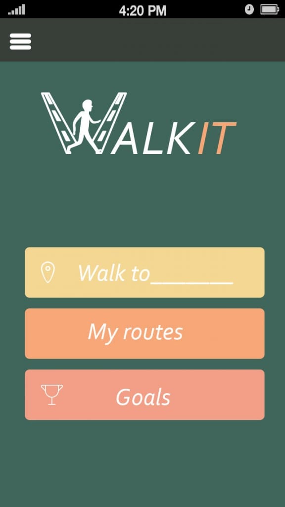
For the app itself I wanted a simpler look. I’m not to happy with my result but I do think it works better then the original. I’m thinking at the moment that a differnt background would work better. But I wanted to stick to a green/yellowy colour scheme representing nature. Also I think they are quite optimistic colours motivating the user to actually go out there and walk.


