Today we have started to learn our 4th and final skill: Designing a clear and structured interface to make it easy to finding relevant information. There are lots and lots of different interfaces out there. Some of them with a great design/concept, but sadly the majority of them aren’t thought through at all. This is crucial in many cases when it comes to finding information quickly and effortless.
In our workshop we’ve been assigned to different areas of research. I’ll be looking at apps around “commuting”.
Research
When searching for “app communting” you quickly find sites using catchwords like “10 Excellent Apps“, “16 Super Useful Apps” and “5 Commuter Apps you should not live without“. However, just looking at the designs I already dislike most of the Apps. Also you find very different things when looking for commuter apps. It goes from music to listen to, books to read, games to play to where did I park my car, what is the fastest way from A to B, where’s the next gas station etc.
I’ve got two examples to show:
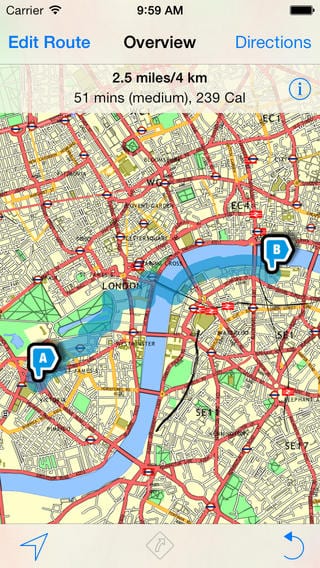
 Walkit is in my opinion a great example for an awful App. First of all I do like the Idea. It is an App that suggest walking routes if you want to go from A to B but also circular routes if you just simply want to go for a walk. You can choose between a direct route or a ‘less busy’ one that will try and avoid major roads and favour off-road paths through parks and by waterways.
However you can only use it in 40+ cities and UK only. If you look at the maps beneath you don’t really feel motivated at all. It looks very clustered and even though they tried to make it look colourful it just looks confusing more than anything. I like the design of the A and B signs but they don’t fit in with the rest of the style. But what annoys me the most is how they show the route. The blue line is way to wide, you have no idea where it’s taking you along because it not only covers the road you’re walking on but roads around it as well.

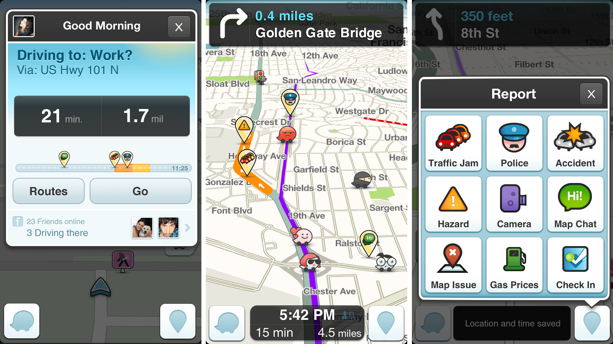
 Waze on the other hand is quite a fun and handy commuter app. It is a worldwide bases traffic and navigation app that allows users to interact with each other. Users can share where speed camaras are placed, police and traffic as well as gas prices. You can also coordinate your ride with other waze users. Waze have their own map system which gets updated and improved all the time. The video below is a good introduction to all it’s functions.
http://youtu.be/R8WKW0xeBxU
Waze is the only app I could find were I liked the idea and the design. It is simple and clear which makes it easy to navigate. The little icons are fun but not in the way and it’s interactive which make you feel much more part of it.